Building a SaaS Design System
Sort of from scratch.
My Role
Ownership of the project and brought about company buy-in on a problem that is preventable.
Led the design system initiative for a 20-person company, serving 50+ users across 1 designer and 6 developers. Presented the business case to company owners and product owners, demonstrating how the system would accelerate both design and development workflows while maintaining visual consistency.
The Problem
Internal Solutions
We are building a backoffice suite that consisted of many products and their teams.
Design, organisation and brand fragmentation would occur without a foundation for all parties to rely on.
A design system holds together the rules that a designer is suggested to use. It helps the teams stay organised and facilitates the reuse of components.
This helps us remain efficient by helping us spend less time designing and developing components that could only be marginally different.
Scale Challenge: As the sole designer supporting 6 developers and 50+ users, it would have been impossible to design every feature detail while maintaining consistency. The design system became essential for enabling rapid development without sacrificing quality.
The Foundation
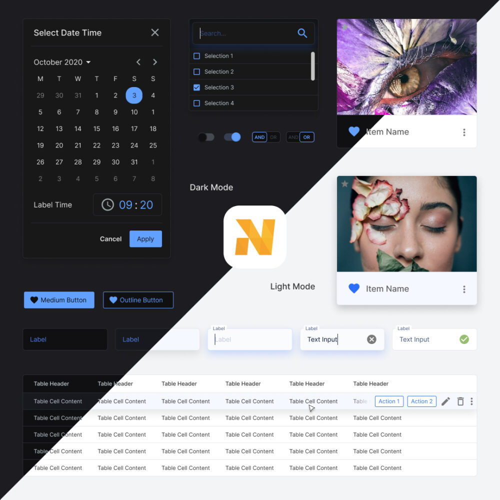
The backbone of the Design System for the design team is the component library.
It is where I began putting together the elements needed to form a solid foundation.
The elements include Atoms, Molecules, Organisms, Templates and Pages.
Further reading into Atomic Design by Brad Frost is highly recommended.
Scale & Implementation: Built approximately 5,000 components including nested variations over 2 months, with development accelerating as more reusable tokens and components were created. Used Material UI and Figma as primary tools, with the system still in active use 7 years later after one major code refactor.
Naming Conventions
To facilitate speedy front end developer handoffs, and cohesion once the team scales up. We followed a naming convention:
theme_platform_type_variant_status
For example: dark_web_button_primary_active or light_mobile_input_text_focused
Spacing
Uniform spacing rules allow the interface to always be consistent. I used the 8pt system, which helped keep everything easily divisible so widths and heights would always fall on the 8pt grid.
Typography
Beautiful typography that scales and falls on gridlines defines the way a product feels.
When deciding on the typeface I paid particular attention to the end-user personas.
A lot of external resources are already available today, which helped guide me in sizing, line heights and margins.
I used web resources and secondary evidence research as a quick start in helping our small team get off the ground.
Key references:
IBM — Carbon Design System
Apple — Human Interface Guidelines
Google — Material Design
Colour
Brand
Colours taken from the branding, used as an accent — usually reserved for graphics. It portrays the friendly, inviting nature of the company culture.
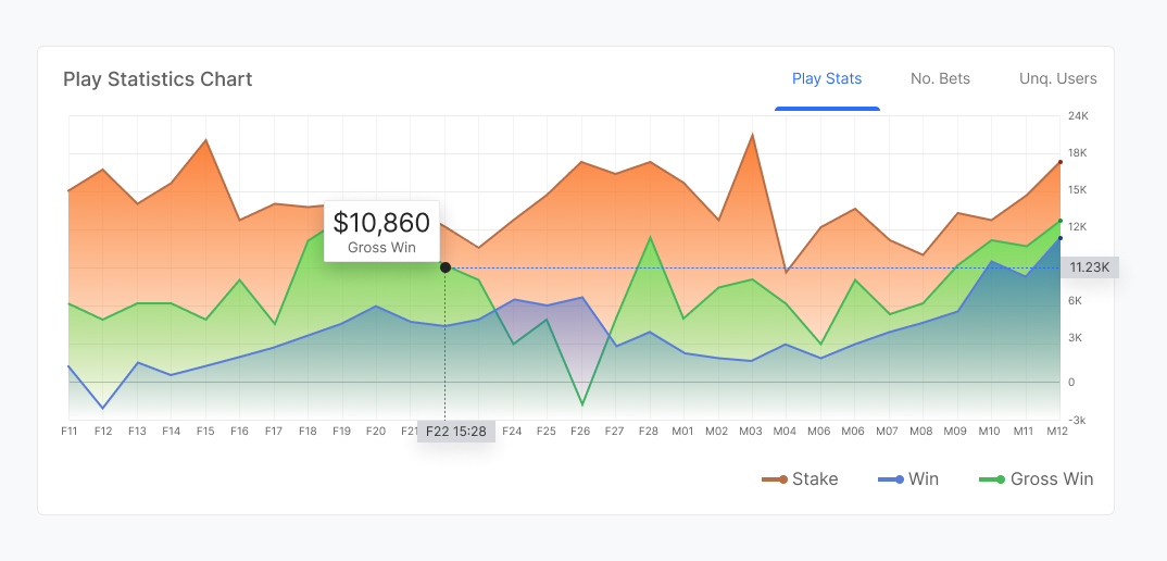
Charts
Being an information-rich SaaS platform we needed colours that could categorise and provide visual cues for related data.
The colours were chosen to keep harmony with the existing palette with a slight leaning towards more saturation to help it stand out from the interface.
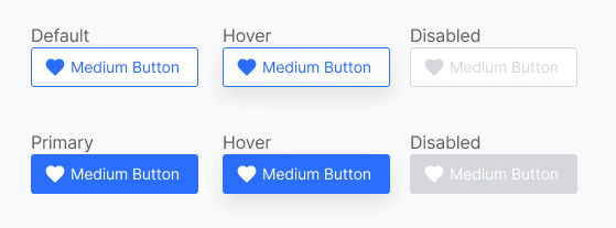
Action
Action colours are signifiers that help the user identify interactive areas. A complementary colour to the brand was chosen to allow CTAs to stand out.
Neutral
Usually in greyscale — based on the principle that content is king. I wanted content and CTAs to remain the focus. This palette forms the largest part of the interface, and was carefully named and organised to allow easy colour changes when building dark mode.

Surfaces
Separated from the Neutral set in preparation for supporting more surface colours. This decision was made purely for scalability and flexibility.
Response
This colour set provides direct feedback from user interactions — split into Positive, Negative and Informative.

Molecules
Buttons
Inputs
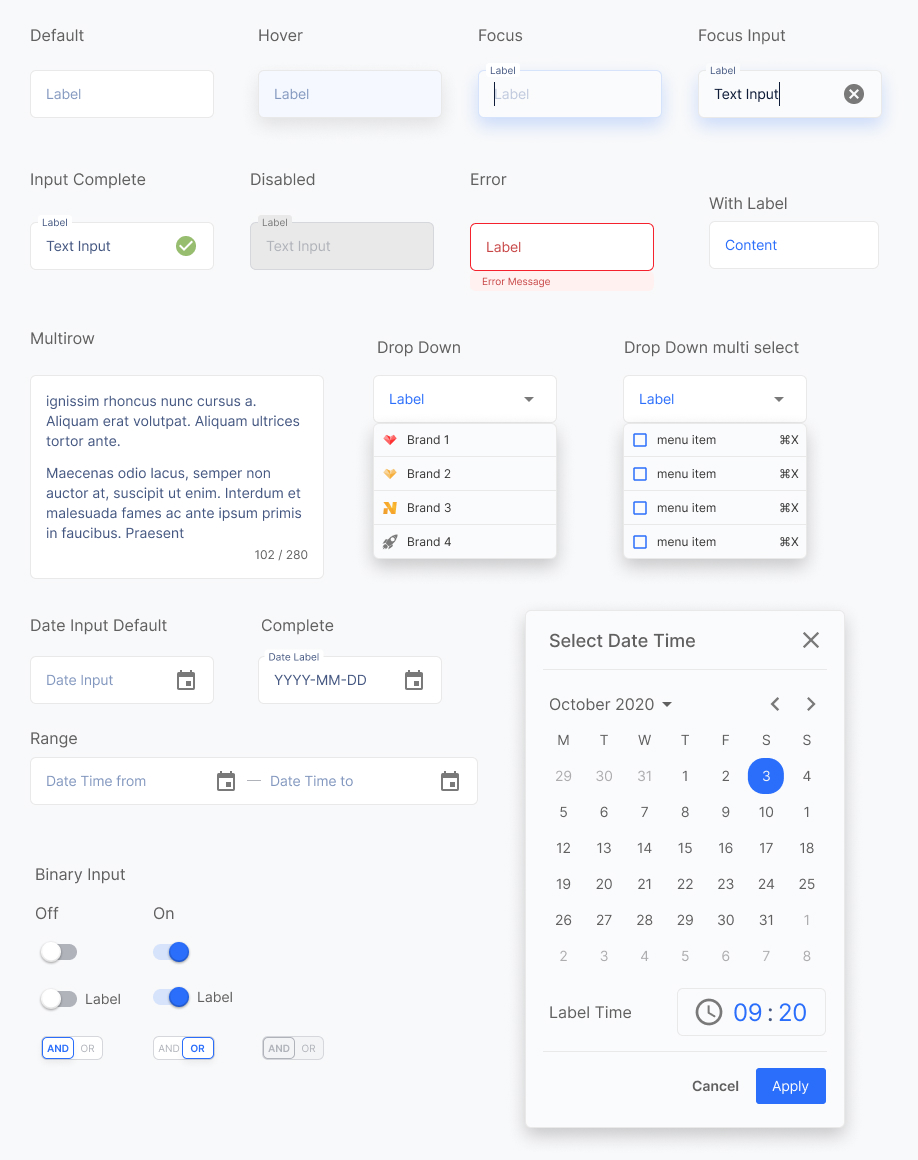
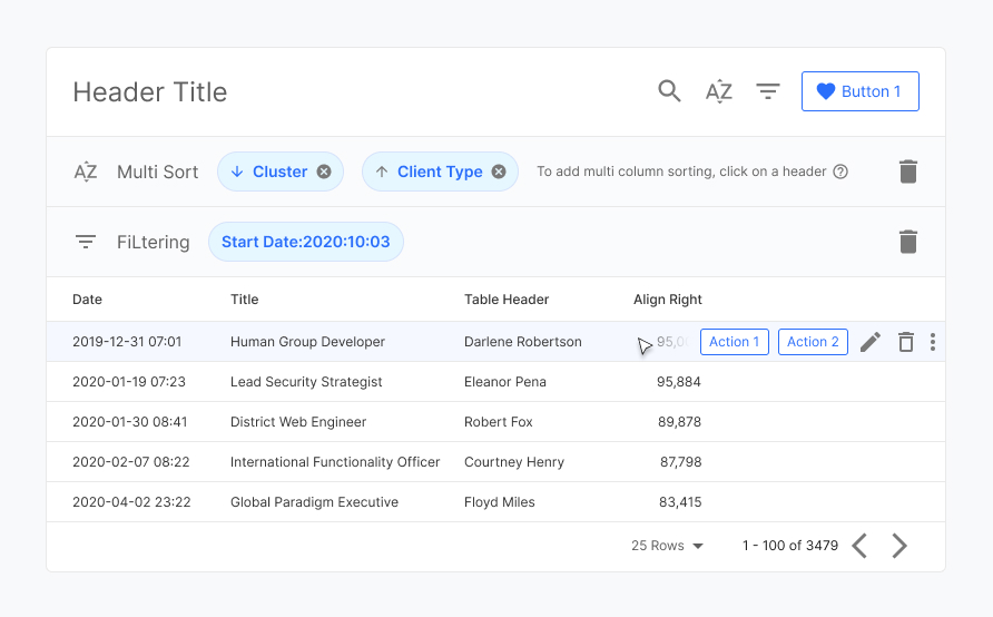
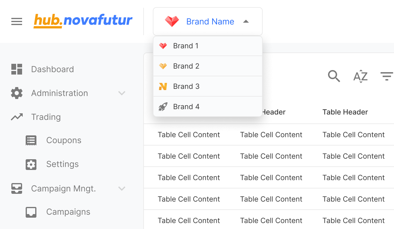
Tables
Tables form a large part of the component library in a SaaS platform. It's still the most efficient way to present detailed data, and is well understood by users — minimising the learning curve.
Within HTML there are two methods of organising data: rows and columns. This depends on the data and how it relates to other data.
In the component library I had to account for these situations and build the design to allow templates to be made with fluidity, without disconnecting from the component library.
Header & Menu
The header and menu form the core of the user navigational system.
A key feature allows users to switch between managed brands. This kept the menu concise and freed space for a future cross-sell feature for other product modules.
Templates & Pages
Base templates were created as a quick-start guide, facilitating team conversations about product aims. They act as a sticker sheet to immediately begin communicating using pre-made user flows and components.
Ongoing Growth
Mobile Translation
As a data-heavy product, mobile translation is a challenge. User interviews would focus on what information is needed most. A grid system was used in development to pre-empt this optimisation phase.
UI Component Testing
As teams grow, potential inconsistencies between UI design and implementation grow too. Closing the gap between design and development is vital for continued growth and efficiency.
Takeaways
A design system is never fully complete — it evolves and optimises as business needs and market trends develop.
Solid foundations allow for smooth transitions when requirements change, saving time and effort that can be invested into team growth and skill development.
As the design team grows, team members can focus on building better user experiences. This concentration of effort allows the SaaS product to be continuously improved, maintaining the client base.
Long-term Success: The design system has proven its value by remaining in active use for 7+ years, supporting company growth while maintaining original foundations. The initial 2-month investment continues to pay dividends through consistent UX and accelerated development cycles.
Team Adoption: While initial adoption required education on the importance of visual details, the system ultimately enabled faster development and better user trust. Developers benefited from repeatable patterns, and users gained a more consistent, reliable interface.