Building a SaaS Design System

Sort of from scratch.

My Role

Ownership of the project and brought about company buy-in on a problem that is preventable.

The Problem

๐Ÿ‘‰ Internal Solutions

We are building a backoffice suite that consisted of many products and their teams.

Design, organisation and brand fragmentation would occurย without a foundation for all parties to rely on.

A design system holds together the rules that a designer is suggested to use. It helps the teams stay organised and facilitates the reuse of components.

This helps us remain efficient by helping us spend less time designing and developing components that could only be marginally different.

ย 

The Foundation

๐Ÿฆด The backbone of the Design System for the design team is the component library.ย 

It is where I began putting together the elements needed to form a solid foundation.

The elements include Atoms, Molecules, Organisms, Templates and Pages.

Further reading into Atomic Design by Brad Frost is highly recommended.

Naming Conventions

๐Ÿค– To facilitate speedy front end developer handoffs, and cohesion once the team scales up. We followed a naming convention

theme_platform_type_variant_status

Spacing

๐Ÿช Uniform spacing rules allow the interface to always be consistent. I used the 8pt system, which helped keep everything easily divisible so widths and heights would always fall on the 8pt grid. Half pixels be gone!
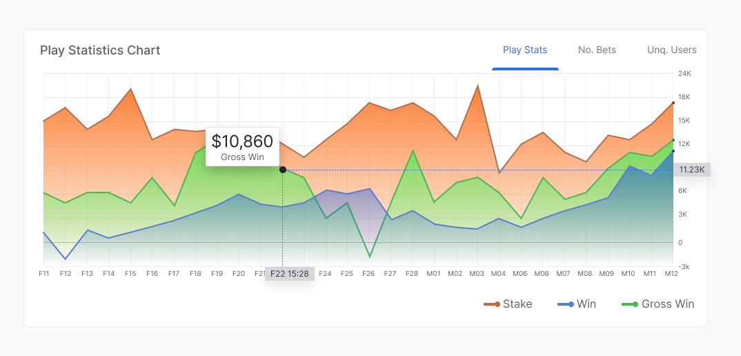
Typography

๐Ÿ“š Beautiful typography that scales and falls on gridlines defines the way a product feels.

When deciding on the type-face I paid particular attention to the end-user personas.

A lot of external resources are already available today, which helped guide me in sizing, line heights and margins.

I used web resources and secondary evidence research as a quick start in helping our small team get off the ground.

Much thanks to:
IBM –ย Carbon Design System
Apple –ย Human Interface Guidelines
Google –ย Material Designย 

Colour

๐ŸŽจ Brand

Colours taken from the branding, are used as an accent, usually reserved for graphics, it portrays the friendly inviting nature of the company culture.

๐Ÿ“ˆ Charts

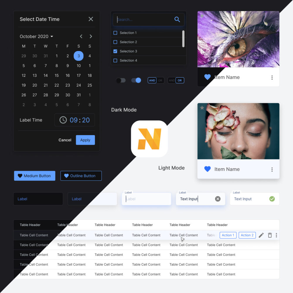
Being an information rich SaaS platform we needed colours that could be used to help categorise and provide visual cues to help the user understand related data.

The colours were chosen to keep harmony with the existing colour pallete with a slight leaning towards more saturation to help it stand out from the interface.
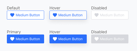
๐Ÿš€ Action

Action colours are signifiers that help the user identify locations of the interface that have interaction significance. A complimentry colour to the brand was chosen to allow the call to actions to stand out. 
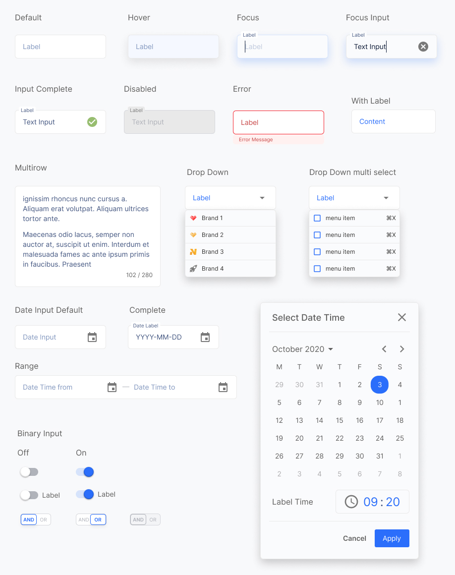
๐Ÿ˜ Neutral

Usually in greyscale, it is a decision based on the principle that content is king. I wanted the content and the call to actions to remain the focus. This pallette helps form the largest part of the interface, as these colours are used to help separate the layout. It was important to get right with naming and organisation to aid easy colour changes when we move on to building a dark mode.

๐Ÿงป Surfaces

Much like the Neutral colour set surfaces was seperated out in preparation for allowing the interface to support more surface colours. A surface group would not have been needed but I wanted the flexibility to use more colours if the situation called for it. This decision was made purely for scalability and flexibility.

๐Ÿ‘‹ Response

This colour set provides the response messaging, where the user has direct feedback from their interaction. It is split into Positive, Negative and Informative.
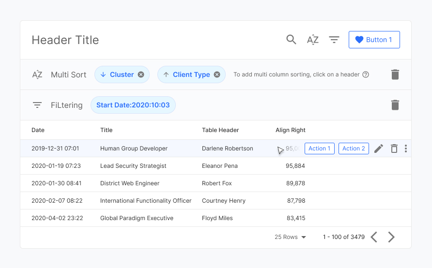
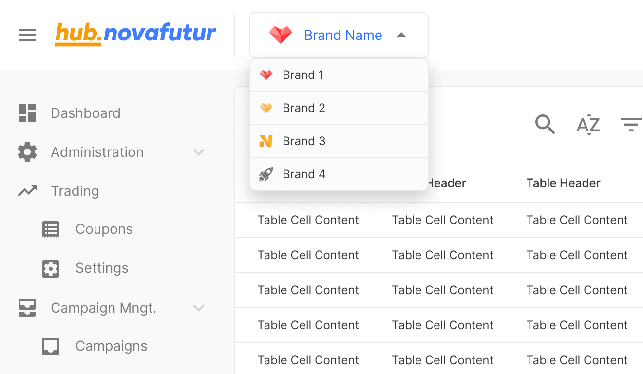
Molecules

๐Ÿ‘‡ Buttons

๐Ÿ‘ Inputs

Tables

๐Ÿ“€ Tables could be seen as a large part of the component library in a SaaS platform.ย 

It is still the most efficient way to present a large amount of detailed data to users, and is well understoodย in its handling. From a usability perspective it minimalised the learning curve.

Within HTML there are 2 methods of organising, in rows and columns. This would depend on the data it is presenting and how that data is related to each other.ย 

In the component library I had to account for these situations and build the design in a way to allow templates to be made with fluidity, and without disconnecting from the component library.

Header
& Menu

๐Ÿฆ The header and menu form the core of the user navigational system.

A key feature is allowing our users to switch the brands they manage. This helped to keep the menu bar concise and reduce repeated sections.

The brand switch freed space to allow for a future marketing feature to be placed which cross sells other product modules that we believe could be beneficial for our users workflows.

Header & Menu

Templates
& Pages

โšก๏ธIn order to provide a quick start guide, base templates were made.

These templates facilitates bringing together teams to communicate the aims of their product/feature. It acts as a sticker sheet to immediately start a conversation, in order to gain insight and produce a brief for the design team to begin thinking in already pre made user flows.

On going growth

๐Ÿ“ฑMobile Translation.

As a data heavy product a mobile translation is often a challenge. Using user interviews to focus on what information is needed the most would be the ideal path. A grid system was used in development to pre-empt this optimisation phase. 

โš™๏ธUI Component Testing

As the teams grow, potential inconsistencies with UI design and the implementation of components also grows. Closing the gap between the team is now vital for continued growth and keeping abreast of efficiencies.

Takeaways

๐Ÿฅก A design system is never fully completed and will continue to evolve and optimise as the needs of the business and market trends continue to develop and pivot.

The foresight of solid foundations allow for smooth transitions of requirements will save time and effort. It can then be invested into growth of the team and it’s skillset.ย 

As the design team grows we allow the team members to concentrate on building better user experiences. This concentration of effort allows our SaaS to be continuously improved maintaining our client base.

The product needs to continuously serve its purpose, build trust and delight in order to succeed.

Next Article

Nova futur Ltd

Building links between products, to benefit users with efficient workflows. 

#DesignThinking #LinkingFlows #Teamwork